The sound of mid-1960s psychedelic rock had a visual language, and most of it was printed to be stapled to a telephone pole. Concert posters from San Francisco’s Fillmore Auditorium and Avalon Ballroom — later joined by work from Austin rooms such as the Vulcan Gas Company — turned lettering into a maze, color into an optical trick, and a weekend bill into something you might keep after the show. Museums now collect them. Dealers grade them. The artists’ estates still hold copyrights. This article is a history of that movement, not a gallery of the posters themselves: we do not reproduce copyrighted 1960s concert art here.
The posters matter to a music site because they were never only decoration. They told you who was playing, they trained the eye to expect a certain kind of night, and they traveled farther than many of the regional singles they advertised. When the 13th Floor Elevators played San Francisco, they entered a room that already had a house style on the wall. Back in Austin, a different group of artists built a Texas variant of the same idea. For the club-level story, see Austin’s 1960s psychedelic scene; for the wider city-to-city contrast, see San Francisco vs Austin.
Two rooms, two numbering systems
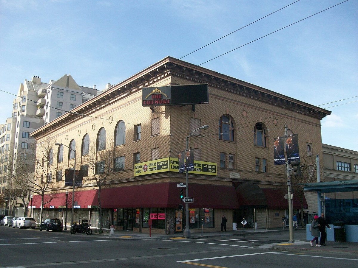
By 1966, San Francisco had two flagship psychedelic halls, and each generated a numbered poster series that collectors still use as a catalog. Bill Graham’s bills at the Fillmore Auditorium (and, later, related Graham venues) are commonly cited by their BG numbers. Chet Helms’s Family Dog productions at the Avalon Ballroom are cited by their FD numbers. The systems were practical before they were a hobby: they identified a specific weekend, a specific printer, and a first printing. Liquid light shows and dancing crowds finished the environment; the poster was the invitation you saw in daylight.
The style that filled those numbered sheets did not come from nowhere. Designers borrowed from Art Nouveau, the Vienna Secession, comic art, advertising illustration, and, in more than one famous case, a nineteenth- or early-twentieth-century book plate that could be redrawn until it felt new. What was new was the density: lettering that seemed to melt, colors chosen to vibrate, and an almost willful refusal of the clean, high-contrast advertising style that had dominated mainstream posters.
Wes Wilson, Bonnie MacLean, and the Fillmore look
Wes Wilson is the artist most often credited with defining the early Fillmore poster. From early 1966 until May 1967 he designed bills for Graham in a style built around swollen, compressed lettering that made the names of the bands into a pattern as much as a text. Writers on the period, and later museum notes, have pointed to the influence of Vienna Secession lettering — especially the work of Alfred Roller — on that approach. Wilson left Graham’s operation after a dispute over payment. He died on January 24, 2020, at eighty-two.
Bonnie MacLean, who had been part of Graham’s office world and was for a time married to him, became the Fillmore’s principal poster artist after Wilson’s departure. She designed many of the later 1960s Graham posters, carrying the house style forward with her own figures and lettering, and continued into the end of the decade. She died in 2020, the same year as Wilson. Any honest history of the Fillmore look has to include both names: the inventor of the early language, and the artist who kept the walls changing after he left.
Moscoso, Mouse, Kelley, Griffin: the rest of the “Big Five”
If Wilson made lettering feel organic, Victor Moscoso made color feel like a wiring problem. He had studied at Yale with Josef Albers, whose teaching on color interaction — including the way adjacent saturated hues can appear to vibrate — became the technical backbone of Moscoso’s mid-1960s posters. Working often under his Neon Rose imprint, he pushed complementary colors and almost unreadable lettering until the poster itself seemed to pulse. It was a rare case of an Ivy League color course walking straight into a ballroom.
Stanley “Mouse” Miller and Alton Kelley, working as Mouse Studios, were the great collagists and recyclers of the group. Their 1966 Family Dog poster for the Grateful Dead and Oxford Circle at the Avalon, usually called “Skeleton and Roses” or “Skull and Roses,” adapted an illustration by Edmund J. Sullivan from a 1913 edition of The Rubaiyat of Omar Khayyam, adding color and lettering until the image became the Dead’s most durable visual emblem — later reused on the band’s 1971 live album. The move was typical of the scene at its smartest: an old plate, a new context, and a design that outlived the weekend it advertised.
Rick Griffin arrived with a different toolbox. He was already known in Southern California surfing and underground-comic circles before becoming a San Francisco poster artist. His “Flying Eyeball” poster for a February 1968 Bill Graham bill — the Jimi Hendrix Experience, John Mayall & the Bluesbreakers, and Albert King, at the Fillmore and Winterland — is among the most famous single sheets of the era. Museum collections (including the Metropolitan Museum of Art and the Minneapolis Institute of Art) now hold impressions of it. The winged-eyeball motif itself drew on earlier hot-rod and Von Dutch imagery; Griffin’s contribution was to make that vernacular feel ceremonial.
In July 1967, Wilson, Moscoso, Mouse, Kelley, and Griffin — the group later nicknamed the “Big Five” — showed together at the Joint Show at San Francisco’s Moore Gallery, a moment when ballroom advertising briefly entered the art-gallery circuit during the Summer of Love. MacLean is not usually counted in that five, which is one reason later exhibitions have had to work to put her back into the main narrative.
Texas walls: Jim Franklin and the Vulcan
Austin’s version of this culture was smaller and later. The Vulcan Gas Company opened at 316 Congress Avenue on October 27, 1967, and poster artist Jim Franklin joined that same month, even living in the building, as the Handbook of Texas records. The Vulcan’s light booth and Franklin’s posters gave Central Texas a visual identity that was related to San Francisco without being a copy of it — armadillos and a more local sense of humor would follow Franklin into the Armadillo World Headquarters years after the Vulcan closed around July 1970. The Elevators, already veterans of the Fillmore and Avalon, now had a hometown room with its own printed language. We go into the club’s history, and Houston’s International Artists label, in the Austin scene article; the point here is simpler: psychedelic poster art was not a California monopoly.
Collecting posters without collecting trouble
If you decide to collect, treat posters with the same discipline you would bring to scarce vinyl. First printings, later authorized reprints, and unauthorized copies can look similar in a thumbnail. Series numbers (BG, FD, and their Texas and other-city cousins), printer marks, paper stock, and documented measurements help, and so do dealers who photograph full margins rather than cropped images. Condition is its own vocabulary: original posters were hung outdoors, so pinholes, staple marks, and fading are common and should be described, not disguised.
Copyright is not a technicality. Most 1960s concert posters remain under copyright, held by artists, estates, or publishers. Buying a legally offered original or authorized reprint is the ethical path; scanning a poster to decorate a website or a T-shirt without permission is not. Museum sites and library collections are the right places to study high-resolution images for research. We follow the same rule on RokyMovie: no copyrighted posters or film stills, only clearly free-licensed photographs, such as the Fillmore’s exterior above, or original art made for this site.
The posters, like the records, are documents of a few short years when a concert advertisement could also be a new kind of American graphic art. Start with the rooms — Fillmore, Avalon, Vulcan — then the artists, then, if you collect, the paperwork. The music is still the reason the paper was printed. For the Texas band that walked into those San Francisco rooms, begin with Roky Erickson and the 13th Floor Elevators and You’re Gonna Miss Me.
Related: Austin’s 1960s Psychedelic Scene · San Francisco vs Austin · You’re Gonna Miss Me · Old Links & Press
Sources
- The New York Times — Wes Wilson obituary
- Smithsonian American Art Museum — Wes Wilson
- Smithsonian American Art Museum — Victor Moscoso
- Cooper Hewitt — Good Vibrations (Moscoso / color)
- The New York Times — Bonnie MacLean obituary
- Rolling Stone — art behind the Grateful Dead’s skeleton and roses
- The Met — Rick Griffin Fillmore / Hendrix poster (collection record)
- Handbook of Texas — Vulcan Gas Company